Nick Richards, one of our Technical Writers delivers this fabulous Lightning Talk on “How to write professionally”. He explains that writing matters to all of us and explores some of the reasons that people are hesitant to write. Nick outlines what our motivation should be when we write and then goes into the nuts and bolts, the tools we are using and the importance of the audience that we write to. A great talk, full of helpful tips that you can apply to improve your writing instantaneously.
Uncategorized
Digital acceleration and a cashless society – an opportunity for digital design teams…
The only thing that’s constant in this world is change. Our world has been moving towards an increasingly digital future but the coronavirus pandemic has proved to be a catalyst when it comes to our behavior surrounding payments. A survey conducted by the Electronic Payments Association and the Strawhecker Group reported that 27% of business owners reported a marked increase in contactless payments in late March1.
This shift to digital payment methods has left a few consumers wary about the dependence on banking institutions. With the rise of contactless payments, merchants have been forced to account for increased costs. With fees as high as three percent, this puts a significant dent in profits.
It isn’t just merchants who are wary. Consumers often complain about the hassle of reversing charges and of the fear of hacks or unauthorized charges depleting their accounts. These fears are very real and in my opinion they present a huge opportunity for digital design teams. I’ve spent 20 years working with financial services firms developing digital products and the advances being made over the previous quarter have outstripped everything over the past decade.
Clearly, design teams have been jumping on this opportunity but there still remains a lot to be done. Consumers these days are increasingly familiar with digital payment options such as PayPal and Venmo but face challenges when paying for services such as hotel bookings, shopping purchases and so on2.
Digital wallets are gaining ground but even their usage is challenged due to the dependence on the physical smartphone. There is a massive opportunity for a design solution that allows customers to seamlessly integrate all of their payments across devices, be it a smartphone, a smartwatch or even a digital banking application.
The underlying technology that makes such integrations possible are Application Programming Interfaces or APIs. These are the digital world’s connective tissue. Older digital solutions used to rely on companies owning the entire value chain associated with payments.
APIs make this a feature of the past. By plugging into a single link in the payments chain and by attaching their own solution to the larger chain using APIs, companies can provide their customers with better and more secure solutions. This ability to plug into an existing system allows companies to develop truly creative solutions since multiple combinations of blocks connected through APIs can deliver different solutions.
A common knock against digital payments is that people in less developed countries are unlikely to use them. Cash is still preferred in many parts of the world. However, the prevalence of digital solutions such as mVisa in Nigeria and PayTm in the Indian subcontinent indicate that digital solutions provide greater financial security and reduce the number of fraudulent transactions in the system.
The secret behind these solutions once again lies in the APIs they use. The cost effectiveness of such digital solutions helps merchants avoid spending large sums of money on Point of Sale systems. Compared to these costs, the fees paid for digital transactions are small.
Close on the heels of the usage of APIs is the move to the cloud in terms of infrastructure. Financial institutions currently rely on expensive I.T setups that draw focus away from service delivery. Leveraging the cloud expertise of SaaS providers is a key step to take in providing a better payment solution and is a huge area of opportunity.
Increasing the seamlessness in payments is where huge opportunities lie. Investing in great UX design will bring the largest returns on investment. While cash might not be entirely eliminated, this doesn’t mean it will occupy the lion’s share of payments. Companies that push digital transformation now stand to gain significantly. It’s time to adapt and grow stronger.
1: Coronavirus surge cashless mobile payments, The Inquirer
2: Consumer Desire and the future of Payments, Visa Blog
An incredible honor to be named on Inc 5000
What an incredible honor. When I got the email last week from Inc. 5000 informing us that we had been awarded “The Fastest Growing Company” accolade, I had to pause for a moment and really let it sink in.
InRhythm is already in the “Inc. 5000 Hall of Fame” as a recipient of this award – eight years in a row. Despite our past awards, this one feels different this year. It’s more special. And it stands out more than the others because 2020 has been such a challenging year for all of us in so many ways.
The award also offers us an opportunity to say thank you. These accolades and achievements would not be possible without tremendous contribution from so many people and the support of our customers. A sincere thank you to all of the InRhythm family including our customers and partners who stand behind us – and with us. Thank you.
We also hold deep gratitude for all the InRhythm alumni who have made this journey possible. We are also tremendously fortunate to have the staff that we do, both long-timers and our recent additions. One special mention is necessary: I want to dedicate this to Max Stevens, an InRhythmer who recently passed away. Our hearts go out to his family and we all miss him dearly.
There is so much to be proud of and even more to look forward to, together. Thank you, all of you, this award is for YOU and is because of YOU.
Gunjan
Vue.Js Mobile Desktop Optimized Images – by Ethan Ozelius as featured on Medium, July 14th 2020
Mobile devices and internet speeds have come a long way. Gone are the days of one wifi bar and a dream, praying the 99 cent 3.1K iTunes song you just purchased for your slick new 8G iPod mini will download in under an hour. If at all.
Nowadays web developers build expensive beautiful web apps with high-resolution professional photography. But even with how far mobile devices have come, high-quality images taken with a decent phone camera can easily reach 5–6 MB, which will not only slow mobile image rendering to a crawl but for many desktop web experiences, could be way overkill.
Optimizing images for desktop and mobile devices requires just a basic understanding of photoshop, some JS foo, and a basic understanding of how images are deployed with your Front End Framework. But the payoff of optimized lighting quick high-quality images will be well worth the effort.
For this tutorial, I’ll use the open-source image editing program Gimp version 2.10, and Vue.js my favourite Front End framework. Let’s start with this high-quality image of a jumbled workbench taken with my OnePlus 5 phone, which has a 16MP camera.

There’s a high degree of detail in this photo, and I want to preserve each leaf, no matter what device I’m using. This photo measures 4608×3456 pixels and weighs in at a whopping 5.6MB.
If I was building a professional photography website, I might leave this image in its current format to really wow website visitors. But for most scenarios, this image could slow performance and rendering, even on a powerful desktop computer with a fast wifi connection. So for this tutorial, I’m going to optimize this image for desktop and mobile by scaling the size down a bit.
You’ll have to play around with each image a bit to achieve the balance of image quality and rendering speed that is right for your application, but in my experience I’ve found that images in the neighborhood of 1200–1600 pixels wide will look amazing on desktop devices. For mobile, I usually go for about 400–600 pixels wide. Once you get the hang of it, you’ll be able to dial in the exact proportions that are right for you.
Before we get to image optimization, let’s organize our Vue app images directory. Create a directory structure that makes sense for your app, my images directory looks like this
// my_vue_app/src/assets/images/
     |__ desktop/
     |__ mobile/
Note: Photo editing and coding are similar in that it’s a good idea to make a copy that you can fall back on if things go south.
To optimize our images, open the original image in Gimp. To Scale an image in Gimp, go to Tools > Transform Tools > Scale
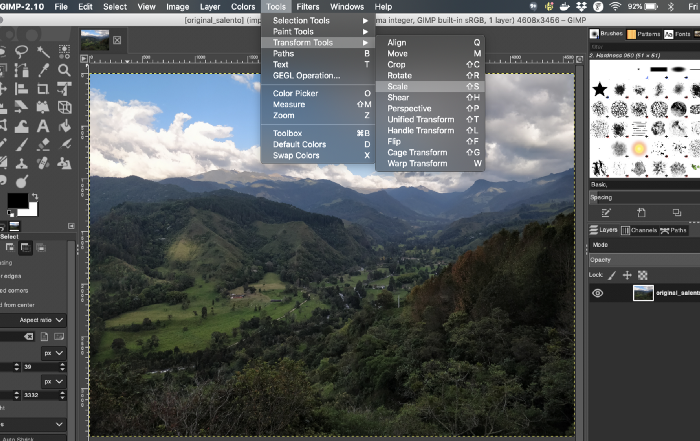
Once the Scale tool is active, click the image, and a dialog box will appear for you to set the new width and height. I always scale the height proportionally to the width, this can be done automatically with Gimp, but selecting the chain link icon in the scaling dialog box. Set the image width to 1600px, and the height will update automatically.
Once the image has been scaled to our desktop dimensions of 1600 x 1200 pixels, copy the image by holding Cmd + C, or Shift + C on Windows and Linux machines.
Next create a new Gimp image file with File > New. Set the width and height on the new Gimp file to 1600 x 1200 pixels and click OK. Once the new Gimp file loads, simple paste your scaled image from clipboard into the new Gimp image with Cmd + V or Shift + V.
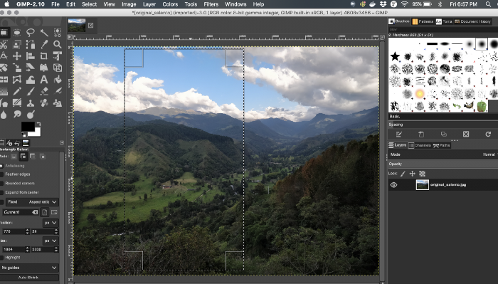
Optimizing for mobile devices is much the same process, with a small caveat. Our mobile images will be portrait not landscape, so we need to select only a section of our original image that will look best on mobile devices.
To select a portrait section of our original image, go to Gimp Tools > Selection Tools > Rectangular Select. Once the rectangular select tool is active, drag across the original image until you find a portrait selection that looks good to you. Once you’ve got it, scale the selection to 500 x 750px, copy the scaled selection, create a new 500 x 750px Gimp image and paste the selection into the new file.
Finally we need to export (not save) our optimized images into our Vue app. In Gimp go to File > Export As, and select the mobile and desktop image directory where you would like your new images to be exported to. Once you have selected your location, another Gimp dialog box will open making sure you are alright with the exporting settings. Note: I’ve always had good luck with the default settings, and was always too impatient to get back to coding to dive too deeply into what each of these settings do, but if you’re curious, dive right in.
With our optimized images exported to their proper directories, you should have an images directory like this.
// my_vue_app/src/assets/images/
     |__ desktop/cocora_valley.jpg [ 981 KiB ]
     |__ mobile/cocora_valley.jpg [ 376 KiB ]
With our optimized images exported to their proper directories, it’s time to dive into the code to serve one of these two images based on screen size.
We will create a simple util function called isMobile.js that will return true if the screen width is less than 500 pixel, while this solution won’t cover every single edge case, it’s good enough for our purposes.
export default function isMobile () {
  return window.innerWidth < 500
}
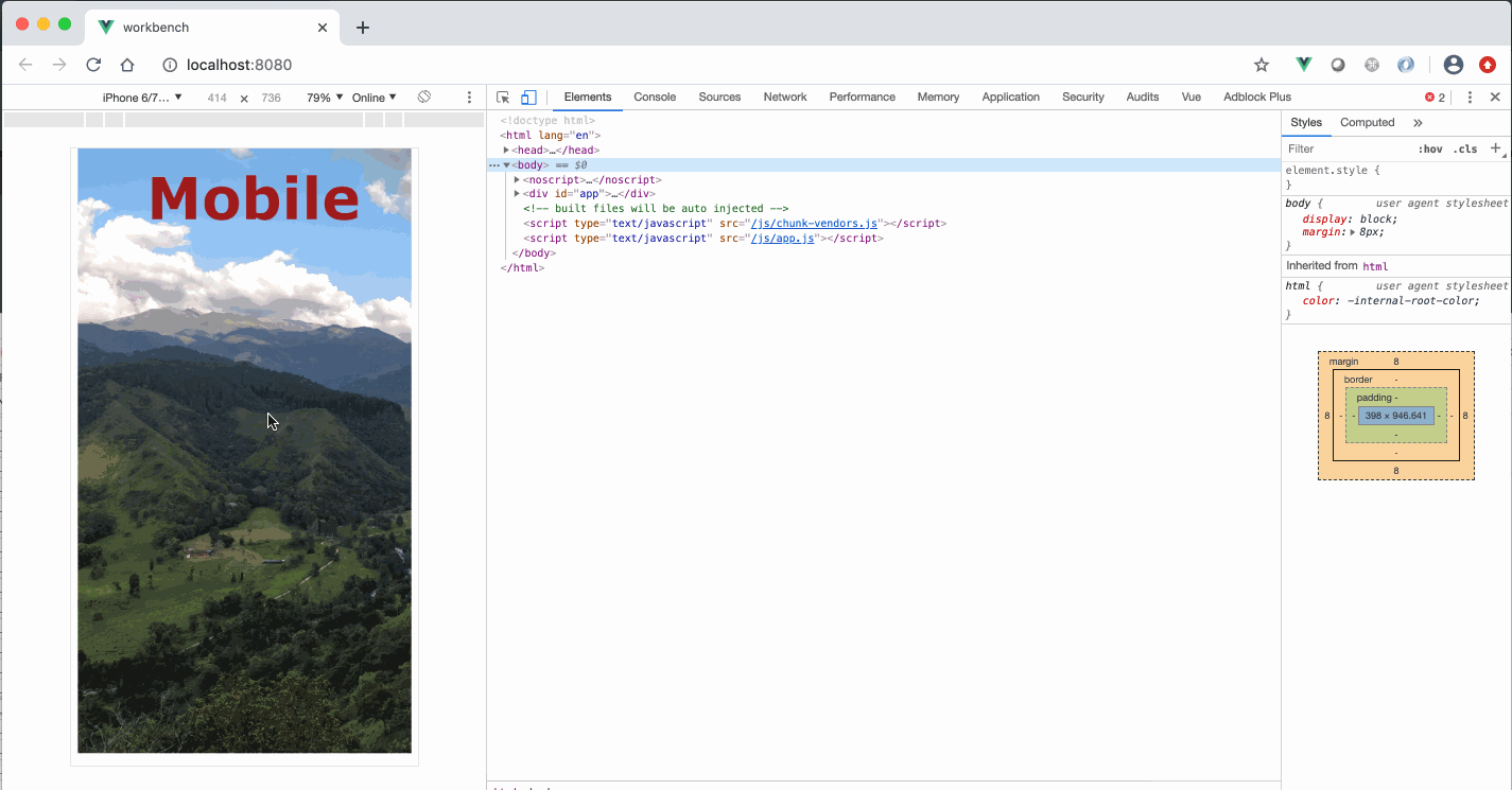
Next create a <Picture /> component
{{ getIsMobile ? 'Mobile' : 'Desktop' }}
The only interesting bit about this component is the <img :src="require(getOptimizedImage)", which dynamically loads an image from either the large or small directory, based on the isMobile() .
Let’s spark up our app to see our work in action!
A quick note about overall build size and how assets are deployed.
When you build your app webpack will likely give you several warnings that your desktop images are larger than the suggested maximum asset size of 244 KiB.
asset size limit: The following asset(s) exceed the recommended size limit (244 KiB).
  This can impact web performance.
  Assets:
    assets/image/desktop/cocora_valley.jpg (981 KiB)
    assets/image/mobile/cocora_valley.jpg (376 KiB)
Relax webpack, we’re pros here.
Obviously these high quality images will significantly bump up our production builds folder’s footprint, but a larger build folder, doesn’t necessarily equate to slower load times. To understand this we need to understand how a deployed app built with Vue CLI is structured (create-react-app is structured in a similar fashion).
When we run yarn build, a dist folder is created with the following structure, containing everything a user needs to interact with our website, images, styles, our Front End code and dependencies.
A dist folder built with Vue CLI will look like this:
drwxr-xr-x   4 ethan  staff   128B Jul 12 14:22 css/
-rw-r--r--   1 ethan  staff   4.2K Jul 12 14:22 favicon.ico
drwxr-xr-x  29 ethan  staff   928B Jul 12 14:22 img/
-rw-r--r--   1 ethan  staff   857B Jul 12 14:22 index.html
drwxr-xr-x   8 ethan  staff   256B Jul 12 14:22 js/
When this directory is deployed to a server, and a browser visits our site, the index.html file is returned to the browser, which contains a <script> tag that loads our app.bundle.js. Once that index.html and app script tag render in the browser, Vue takes over and brings all it’s Vue magic!
Only when our <Picture /> component is rendered, will the <img :src="require(getOptimizedImage)" initiate a network request for our image.
As opposed to everything, styles, images and JS code all being bundled into one single massive app.bundle.js file. Which is how some Front End build tools used to function. *a-hem* not naming names, I’m sure it made a lot of sense at the time.
This means that I can confidently build mobile and desktop images into the same build and not worry that mobile users will be bogged down by unnecessarily loading desktop images and vice versa.
Enjoy!
Ethan Ozelius
https://ethanoz.com/
https://medium.com/@e.ozelius
Deliver your products to market with the highest velocity and prevent what happened to GE Digital
Last week, the WSJ published an article “The Dimming of GE’s Bold Digital Dreams’ that delivered fascinating insights into what went wrong with the company’s plan to transform itself into a software powerhouse.
The piece resonated with me since I have structured our business and service offerings in Enterprise Transformation to help companies prevent what happened to GE Digital.
Here is a short overview of the issues that were highlighted in the article and our approach to address these with our clients’ digital transformation journey.
Issue 1: GE didn’t assess the probability of a realistic transformation
In 2014, GE’s CEO Jeff Immelt correctly saw that in order to survive into the future, GE would need to transform itself from a company known for power plants, MRI machines and aircraft engines to a company that could dominate the industrial software and digital solutions space. He tasked a High Impact Innovation team to deliver a demonstration of apps and software that could be used across internal departments. There was just one problem: No one knew how to go about implementing Mr.Immelt’s vision.
Our approach:
Mr. Immelt had the right intentions (to transform the company into a software powerhouse) but it didn’t seem that the desire for this digital transformation was rooted in customer needs or was assessed properly. When we take our clients on a Digital Transformation Journey, we start with a 6 week assessment, called Pulse.
By diving deeply into our clients’ current business operations and benchmarking against industry best practices, we uncover unrealized potential and opportunities early in the process. We identify the highest-impact changes to best increase capacity, and determine how to build on existing strengths, overcome current obstacles, increase efficiencies, and create high-performing teams.
This vital step was seemingly skipped at GE Digital.
Only at this stage can a company implement actionable solutions and realistic plans that tap into the full potential of the organization to get to where it needs to go.
Issue 2: GE pretended to have the necessary skill for being a ‘digital-industrial’ company
When the “High Impact Innovation Team” presented to Mr. Immelt, he liked it but it turned out the apps were flat design visuals with no working machine behind it and his Executive Leadership team had never assigned a budget to their Digital Transformation. Meanwhile, GE’s communications office was launching the company as the world’s first “digital-industrial” company in press releases. Revenues from digital solutions were forecasted at $15billion for 2020 and the company achieved $3.6b in 2016 largely from it’s own industrial units. That year, GE Digital was on track to spend $5b.
Our approach:
From immersive Boot Camps to Intellectual Training and Concentrated Coaching, we provide our clients with in-depth education to provide the skills that are necessary to embark on a Digital Transformation. A ‘more action, less lecture’ style provides a better understanding of fast-track agile adoption and accelerated product development that was clearly missing at GE.
Issue 3: GE inverted the usual industry model of engineering a single piece of software that can then be sold and resold
With no coherent strategy in place and a lack of well thought out processes, GE’s product development path was wasteful. Instead of charging a small team with developing the best product and then letting the operation grow with the product’s evolution, GE set up a huge organization that wasn’t quite needed yet. Problems increased when Mr. Immelt kept pushing for the initiative, while it became obvious that the software platform had no viable proposition, internal departments didn’t want to use it and even the sales force wasn’t sure how to pitch it. The desire to create a GE-owned and operated cloud was stopped by limited resources and time thanks to competition coming from Google, Oracle, Amazon and Microsoft. The software platform was slow and with the acquisition and integration of new companies and their tools, the software’s code became messy. After Mr. Immelt left in 2017, a new CEO took over, was fired in 2018, and his successor Larry Culp sold a part of the business and named a new CEO to turn it around.
Our approach:
Committed to leveraging modern, agile best practices, GE Digital should have worked with small teams to deliver their software platform to market with the highest velocity. We work in iterative Design Sprints to understand, plan, design and test to rapidly create an MVP From here, clients can create a testing plan and establish future iterations built for scale. We call this Product Studio, where we build the best version of our client’s product from design to deployment in under 120 days.
This Was missing in that early 2014 meeting between Mr. Immelt and his “High Impact Innovation Team”.
