• Skip to main content
  • Skip to footer

InRhythm

Your partners in accelerated digital transformation

  • Who We Are
  • Our Work
  • Practices & Products
  • Learning & Growth
  • Culture & Careers
  • Blog
  • Contact Us

UI

Feb 14 2023

What Does Your Innovation Timetable Look Like?

Overview

Innovation is at the heart of almost every business. Companies that can innovate quickly and frequently have significant competitive advantages, easily attract top talent, and provide excellent customer experiences.

However, this is easier said than done. Although most organizations agree that being able to innovate is the key factor that will help them stand apart from the crowd, there are substantial roadblocks to achieving simple advances. 

So… How do top companies innovate rapidly?

They understand a few core principles:

1. Time Is Money

Companies are often sidelined by a standard argument:

“We don’t have the budget right now.”

Innovative companies understand that every minute you wait to implement new ideas, even more dollars are left on the table. The balance of opportunity, cost, and wins is a relevant act, that requires a substantial amount of careful and calculated attention and execution.

2. Looks Are Everything
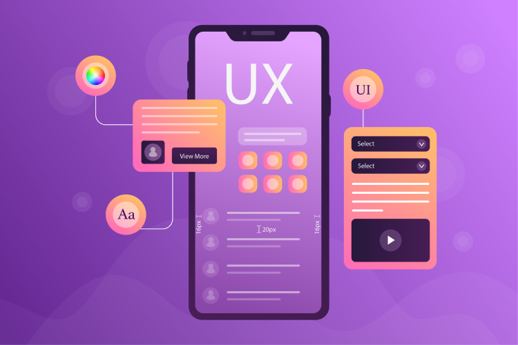
A heavy focus on UX Design and usability are key components to highly advanced companies.

Rapid iterations on design and function are a pertinent response to customer needs, setting advanced companies on a fast track to favorable brand image and reputation.

3. Right Resource Allocation Goes A Long Way
Introducing new products and features regularly can be taxing on an existing team, and the best people to get the job done may need to be added.

Companies that know how and when to implement talent can successfully curve innovation quickly. From experts in modern frameworks to responsive web, experience is key to get the job done.

4. There’s No Room For Reactive Planning

Upcoming initiatives often have a way of creeping up on companies.

There are typically foundational tasks that need to be taken care of prior to kick-off and resources need to be lined up, in place, and ready to roll when the green light is lit. To circumvent reactive planning, top companies partner with experts to help them tackle foundation tasks, line up the right tools and resources, and plan for big projects.

How and how often companies innovate is a defining metric to consumers – to both meet and exceed customer expectations.

Closing Thoughts

Allotting time for innovation allows organizations to get ahead.

If you concentrate all your energy on operating within the status quo, someone who has learned to set aside time for innovation is going to come along and define the space while you were busy maintaining your current process.

The number one thing you can do to propel your organization forward is to give innovation a leading piece.

Written by Kaela Coppinger · Categorized: Agile & Lean, Culture, Design UX/UI, Learning and Development, Product Development · Tagged: agile, INRHYTHMU, learning and growth, product design, product development, UI, ux, uxui

Dec 20 2022

Top 5 Best Practices For Building Forms

Various forms like sign-ups, logins, or checkout pages are seen everywhere in applications and websites, but what attracts a user to fill one out? What exactly makes one click the sign-up or call-to-action button on the page? Forms exist to be filled out, but there are a surprising number of forms which—through poor design, excessive fields, or other factors—push users to abandon them, unfilled. Make your forms simple and easy to navigate, and watch the data come flowing in.

Here are a few best practices when putting together your own forms to keep engagement high:

1. Ask For Less Information (and have an easy login!)

If you have a page with a sign-up flow for a new mobile app, what do you want to know from your user? It depends on what the product is and why you need the information from them. As an example: a date or friend matching platform would want your age, gender, and zip code on one screen. The next page could be preferences about the person you are hoping to match with. All of this information is necessary for the app’s purpose, but connecting to Facebook or Google has also made it much easier to skip certain steps in this process, allowing for less info needing to be manually filled out.

The following demonstration shows just how easy it is for the user to access all of the fields needed—i.e. name, picture, friends—from the Facebook API instead of filling out the same information manually.

No alt text provided for this image

2. Single-Column Ease vs. Multi-Column Stress

When you’re making a form, make sure it’s displayed in a single-column instead of a multi-column. This design element will make it easier for users to scan through and complete instead of trying to tab through different fields and with the potential of resulting frustration.

The following demonstration illustrates, the relative ease for a user to scan through one column, answering questions in a linear format instead of doing a Z-pattern back and forth.

No alt text provided for this image

3. Automate, Automate, Automate

One of the best form practices for improving design is automation. Automation makes it easier for the user to go through fields, without worrying about switching from lower and upper cases. The only fields that should not be capitalized are emails and passwords, since those cause delivery issues.

4. Progress Tracker

A user who is filling out a form—unless it’s a simple sign-up—wants to know how long the process will take them, and maybe even if it should be filled out now or saved for later. For mobile and desktop alike, a progress tracker should be included, like the examples shown below.

No alt text provided for this image

If the user is on a certain step it’s important to note that as well, all within an easily understood display of what they’ve already completed.

5. Testing (even when you don’t want to)

This is the step that many don’t even think of taking, since the design could be flawed and more time could be wasted in redesigning. The form you just created should be tested on a few different devices (at the very least on mobile and desktop) to see if it actually works and makes sense. What’s the point of developing a product that doesn’t work for the user?

The ultimate goal is getting the user to click on the “continue” or “submit” buttons in the end. By following these best practices, you can remove common roadblocks in form submissions and make the experience better for your users. 

Written by Kaela Coppinger · Categorized: Design UX/UI, Learning and Development, Product Development · Tagged: best practices, design, design patterns, Designers, INRHYTHMU, learning and growth, product development, UI, ux, uxui

Dec 20 2022

A Comprehensive Introduction To Apple’s Human Interface Guidelines

Overview

No alt text provided for this image

Human Interface Guidelines suggest how interface components should look and how users will interact with them. There are as many ideas about interface design as there are proponents of any particular library or API. 

All interface designs share a similar goal, which is to create a unified user experience across the environment. To accomplish that, the guidelines help make their design’s interface intuitive, consistent, and learnable, both for the OS for its applications and tools. All interface elements and their guidelines should be included in an interface design document with usage examples, when practical. For example, buttons, checkboxes, dialog boxes, application views, buttons, bars, etc.

In Hamid Mahmood’s Lightning Talk session, we will breaking down the following topics:

  • Overview
  • Human Interface Guidelines
  • Customer Impact
  • Live Demonstration
  • Closing Thoughts
  • Additional Resources

Human Interface Guidelines

No alt text provided for this image

Apple was one of the first companies to use “look and feel” in their literature when referencing the MacOS interface in the 1980s. As technology advanced, ideas on interface design also advanced.

Today, Apple has “Human Interface Guidelines” that establish how an application should look and feel to users on all of its platforms.

Apple’s HIG is an extensive document covering all aspects of application look and feel across the entire Apple ecosystem. There is a platform-specific HIG for each Apple OS environment: 

  • macOS for MacBooks
  • iOS for iPhone/iPad
  • watchOS for Apple Watches
  • tvOS for Apple TV

Apple’s HIG is organized by platform and technologies. Each platform is subdivided into sections. For iOS, for example, the sections cover architecture, user interaction, system capabilities, icons and images, bars, views, controls, and extensions.

From the iOS section topics, it’s evident that Apple is invested in ensuring that applications on their platform have that certain Apple “look” and that those applications function in a consistent manner. 

Consistency is an important factor in user uptake of new applications. When UI elements function similarly, it’s easier for users to transfer their operational knowledge between applications. 

Using the HIG helps maintain the quality of applications by guiding UI decisions to support the application’s operation. Following the HIG will improve engineering and design decisions by helping programmers anticipate what most users will expect from an application’s interface.

It’s important to remember that the HIG does not dictate how an application operates, it describes the user/application interaction through visual cues, controls, and application feedback.

Customer Impact

No alt text provided for this image

When followed, the Human Interface Guidelines ensure that the components of an application’s UI are understandable to the average Apple user through familiarity with the OS and with other applications.

Maintaining a consistent interface helps create an application interface that is more rapidly accepted and gives users an increased feeling of being in control, which creates a positive user experience. A side benefit is that an application will complete the App Store approval process in a more timely manner because the UI and its controls appear and operate in the manner expected by the reviewers.

Live Demonstrations

Hamid Mahmood has crafted an intuitive walkthrough demonstration of the advantages of application coding within Apple’s Human Interface Guidelines:

No alt text provided for this image

Be sure to follow Hamid’s entire Lightning Talk to follow along with these steps in real time.

Closing Thoughts

No alt text provided for this image

Apps in this era of phones, laptops, tablets are not restricted to one device. Nor are users.

Therefore, it becomes imperative to adhere to some consistent UI guidelines to ensure a seamless experience and broader adoption by users. The cut-throat competition between iOS and Android has been good for both, making them more polished, more feature-packed and technologically potent. The best design services know how crucial it is to keep these guidelines in mind when designing interfaces on iOS and Android.

Happy coding!

To learn more about the implementation of Apple’s Human Interface Guidelines and to experience Hamid Mahmood’s full Lightning Talk session, watch here. 

Additional Resources

  • Apple’s Human Interface Guidelines: https://developer.apple.com/design/human-interface-guidelines/

Written by Kaela Coppinger · Categorized: Design UX/UI, Learning and Development, Product Development · Tagged: best practices, design, Design Programs, Designers, INRHYTHMU, learning and growth, product design, UI, ux, uxui

Dec 20 2022

The Top 5 UI/UX Design Programs For Developers

Overview

No alt text provided for this image

Let’s begin with the basics:

  • User Experience (UX) design is how a person feels about using a product, whether that be a website, mobile application, or anything human-computer related.
  • User Interface (UI) design, by comparison, is all about the look and feel of the design itself; in other words, the colors or icons a person sees on the page.

While it may seem relatively straightforward, there are a variety of free and paid tools for UX and UI, that are specialized and distinctive to this level of design work.

So, the question becomes which programs are the best? If you get an assignment from your boss and need to do a wireframe or mockup quickly, which program can a developer use if there isn’t one specified?

The staple Adobe Photoshop and Illustrator just don’t do the trick for creating fast designs, but thankfully there are a few easy, intuitive programs that can help get the job done:

1. Sketch

No alt text provided for this image

Sketch has been one of the most popular programs for UX/UI designers to use since its launch in 2010. Sketch is used to create different sized artboards for various browser sizes, apps, or even banners, allowing a designer to format their design to fit the multiple standard dimensions on the fly.

Sketch’s linking to the InVision application, allows one to create a prototype of their artboards. Sketch isn’t trying to compete with larger, more established programs like Photoshop, but instead is focused on trying to make UX and UI easier with features like converting drop shadows in CSS in order to save time for developers, making it easier to pinpoint exactly which code to use in the project’s final execution.

Price: $99 For Mac Users

2. InVision Studio

No alt text provided for this image

InVision first came out with an easy-to-use prototyping tool that syncs with Craft directly on Sketch. Over the years, they came out with their own design program—Studio.

Product Manager, Karla Smagorinsky from InVision, who works directly with Freehand, describes its best use case: “Studio is a new type of screen design tool that gives designers the power to quickly create high-fidelity prototypes with rich motion and micro-interactions that leave nothing open to interpretation. This means designers and digital product teams can have higher quality feedback sessions with both internal stakeholders and external users, allowing companies to move faster and release higher quality products.”

Studio differentiates itself from Sketch by rapid prototyping, and adaptable layouts; overall, InVision has an ecosystem of great tools like Freehand, Inspect, Design Manager System (DSM) and more!

Making it a great tool for designers needing to link up two items (like wireframes and prototyping) in the fastest way possible for a low cost.

Cost: Free for both Studio (only on Mac) and prototyping tools (web-based)

3. Adobe XD

No alt text provided for this image

Adobe had to put themselves back on the market in 2015 after the launch of Sketch.

Adobe XD has a number of features that position it as an evolving staple for UX/UI designers, including, but not limited to its repeat grid structure, so a user can select objects and then repeat those objects along an x- or y-axis.

Adobe has also created reusable symbols, so it’s easier to place objects in multiple artboards. The best part of having a product like Adobe XD is that it’s integrated into one platform primary platform (Adobe Creative Suite), therefore making it easier to receive feedback and allow follow-up iterations based on primary prototype designs.

Price: $9.99/month for the standalone product (works on Macs and Windows) or $49.99/month as part of the Adobe Creative Cloud Suite

4. Figma

No alt text provided for this image

Figma lets designers build dynamic prototypes and mockups, test them for usability, and sync up all of the progress.

Figma allows for a collaborative environment where multiple people can work on a project at the same time, much like Google Docs — letting designers see which exact team members have it open in order for real-time collaboration. Designers will see who’s working and what they’re doing.

It’s browser-based, making it accessible to everyone in an instant.

Price: Free for individual use, $75/month for team editing subscriptions

5. Axure

No alt text provided for this image

Axure functions in prototyping and keeping track of the workflow. It features a smooth interface to document as developers progress. High fidelity drives this app, resulting in prototypes full of details.

Axure offers many of the other features of popular prototyping and UI design tools. It allows for testing of functionality and puts everything together for an easy developer handoff. This, combined with an emphasis on communication, ensures that everyone on a project is kept up-to-date with progress and changes as they happen in real time, making Axure a solid choice for UI design.

Price: $25-$45/month based on specific team subscription needs

Closing Thoughts

No alt text provided for this image

The best UI design tools can help developers create realistic, functional prototypes quickly and easily. Each designer has their own favorite, and many use more than one tool since each option has its strengths and weaknesses. 

Whether a designer’s primary focus is on UX or UI, or they’re trying to marry the two together, having quality tools in their toolbox will both streamline and bring ease to the accomplishment of tasks. 

Written by Kaela Coppinger · Categorized: Design UX/UI, Product Development · Tagged: Design Programs, Designers, INRHYTHMU, learning and growth, UI, ux, uxui

May 01 2019

Sprint 2.0: 4 Day Design Sprints

It was a humbling experience to kick off the InRhythmU Speaker Series at InRhythm HQ. InRhythmU was created to foster a culture of continuous education through onsite events and comprehensive workshops for anyone who is looking to learn and grow in their field. As the Director of UX/UI Design at InRhythm, it seemed fitting to give a talk about Design Sprints and how it impacts the speed to market as well as the creativity a group can bring to a room when working together.

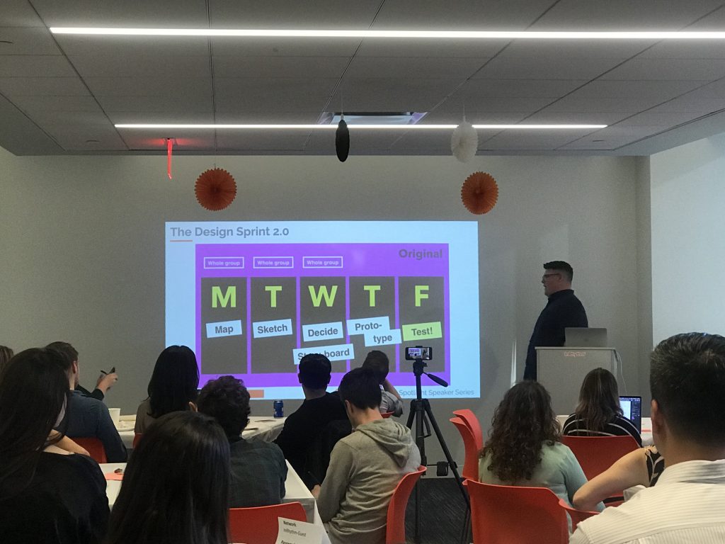
We started the session with a brief overview of where UX/UI sits in the cadence of a products journey, showing where intelligence (UX) meets creativity (UI). We discussed the difference between design thinking and design sprints and then the sprints themselves, which was started by a group from Google Ventures in 2016. The five day sprint is a team workshop for learning, iterating, creating and deploying. Sprint 2.0 is a four day sprint with even more collaboration and problem solving.

While we discussed the iteration process, we did a hands on task of Crazy 8s, where attendees were giving a module to design and had eight minutes to create eight drawings per minute. The attendees were a mix of designers, product owners, scrum masters, engineers and marketers, which is the perfect cross section for this exercise. While the start was slow, the group found their footing and cruised through drawings. Coming up with idea after idea in the 8 minutes allotted. The mix of job types showed how a group can have a similar idea for a singular task.

We concluded by discussing how this methodology not only builds experiences quickly and creates a strong team dynamic but gives us the option to test our ideas. Testing creates a level of flexibility that only breeds better experiences and if everyone brings this type of creativity, iteration along with strong dynamic back to their jobs and creates some next level experiences for us all.

You can watch the full session here. Apologies in advance for the sporadic use of profanity.

Written by Jan Schüler · Categorized: Design UX/UI, Events, InRhythm News, InRhythmU · Tagged: design, design sprints, UI, ux, uxui

Footer

Interested in learning more?
Connect with Us
InRhythm

110 William St
Suite 2601
New York, NY 10038

1 800 683 7813
get@inrhythm.com

Copyright © 2023 · InRhythm on Genesis Framework · WordPress · Log in

This website uses cookies to improve your experience. We'll assume you're ok with this, but you can opt-out if you wish. Cookie settingsACCEPT
Privacy & Cookies Policy

Privacy Overview

This website uses cookies to improve your experience while you navigate through the website. Out of these cookies, the cookies that are categorized as necessary are stored on your browser as they are essential for the working of basic functionalities of the website. We also use third-party cookies that help us analyze and understand how you use this website. These cookies will be stored in your browser only with your consent. You also have the option to opt-out of these cookies. But opting out of some of these cookies may have an effect on your browsing experience.
Necessary
Always Enabled
Necessary cookies are absolutely essential for the website to function properly. This category only includes cookies that ensures basic functionalities and security features of the website. These cookies do not store any personal information.
Non-necessary
Any cookies that may not be particularly necessary for the website to function and is used specifically to collect user personal data via analytics, ads, other embedded contents are termed as non-necessary cookies. It is mandatory to procure user consent prior to running these cookies on your website.
SAVE & ACCEPT