• Skip to main content
  • Skip to footer

InRhythm

Your partners in accelerated digital transformation

  • Who We Are
  • Our Work
  • Practices & Products
  • Learning & Growth
  • Culture & Careers
  • Blog
  • Contact Us

uxui

May 23 2023

How To Effectively Measure The Direct Impact Of Your Design Language System

Author: Ashton Coghlan, Senior Product Manager and Oleg Ivanov, Design Tech Architect @ InRhythm

Overview

The work of your designers has a substantial impact on your business, despite it sometimes being a challenging, tangible KPI to measure. Showing the value of your designers’ work, can result in a positive focus on business goals around the needs of your users. You can start driving value around the infrastructure of a Design Language System so that your designers can focus on higher value problems, moments of delight in your customers’ experiences, and your overall product quality. A Design Language System can help refine the quality of your product by making the experience more consistent, predictable, and accessible. 

In order to understand the lasting impact of a Design Language System in your organization, we’ll be prioritizing some high-level subject areas:

  • Overview
  • What Is A Design Language System?
  • How Do We Measure The Business Impact Of A Design Language System?
  • What Are The Leading Indicators To Measure Impact?
  • Design Efficiency
  • Developer Efficiency 
  • Closing Thoughts

What Is A Design Language System?

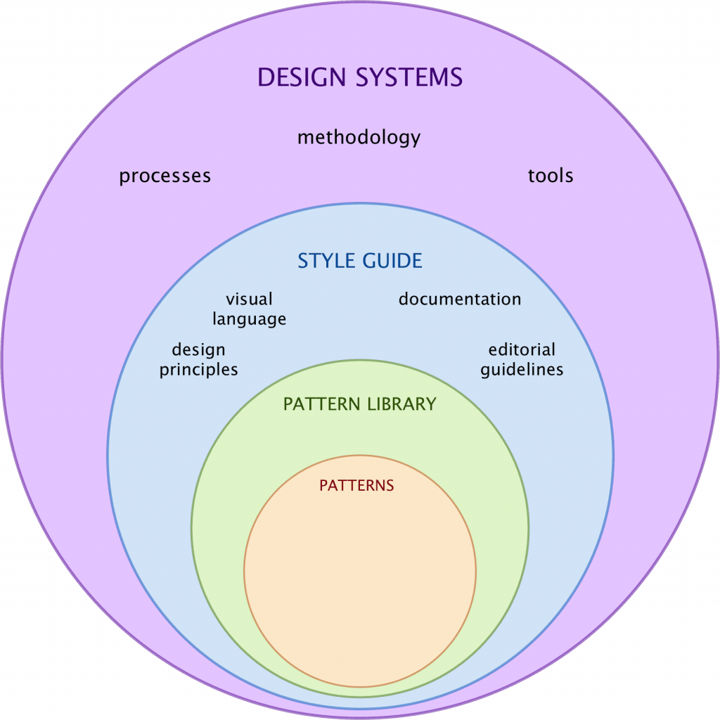
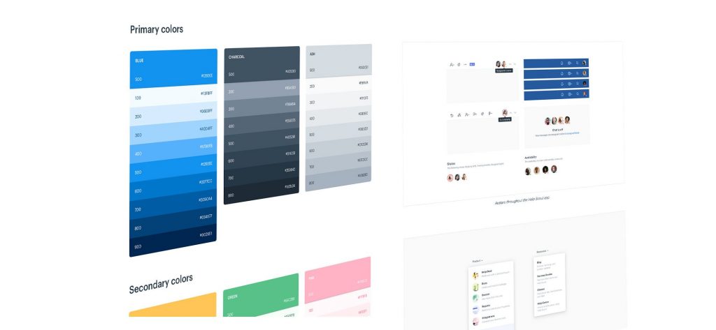
A Design Language System is a collection of reusable design components, guidelines, and standards that are used to create a consistent and cohesive user experience across an organization’s products and services. It is a set of rules and principles that guide the design and development process, ensuring consistency and coherence in the design of digital products.

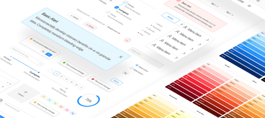
A Design Language System includes not only visual elements like typography, color palettes, and iconography, but also components like buttons, forms, and navigation menus, as well as guidelines for interaction design, accessibility, and branding. The purpose of a Design Language System is to streamline the design and development process, reduce inconsistencies, and improve the efficiency and effectiveness of design teams. It also ensures a better user experience, making it easier for users to interact with and navigate through digital products.

How Do We Measure The Business Impact Of A Design Language System?

Measuring business impact is important because it helps organizations understand the value that their Design Language System is providing to the business. By tracking key metrics, organizations can identify areas where the Design Language System is driving business outcomes, as well as areas where it may need to be improved.

Here are some key metrics to measure business impact:

  • Return On Investment (ROI): This metric measures the financial impact of the Design Language System on the organization. It helps to determine whether the investment in the Design Language System is paying off in terms of increased revenue, cost savings, or other financial benefits.
  • Time To Market: This metric measures the speed at which new products or features can be launched to the market using the Design Language System. It helps to determine whether the Design Language System is enabling the organization to be more agile and responsive to market changes.
  • Customer Satisfaction: This metric measures how satisfied customers are with the products or services that are built using the Design Language System. It helps to ensure that the Design Language System is meeting the needs and expectations of customers, and can also provide insights into areas where improvements may be needed.
  • Employee Productivity: This metric measures the efficiency and effectiveness of the design and development teams that are using the Design Language System. It helps to determine whether the Design Language System is improving productivity, reducing errors, and enabling teams to work more collaboratively and efficiently.

What Are The Leading Indicators To Measure Impact?

Adoption and usage are the only things that matter after you know what you need to build. And the sneaky hard part of this is you often don’t know what you truly need to build until you measure adoption and usage. (This is where the magic of Product Management comes into play!)

Here are some key metrics to measure adoption and usage of a Design Language System:

  • Number Of Active Users: This metric measures the number of users who have actively used the Design Language System components in a given period, such as a week or a month. It helps to gauge the reach and impact of the Design Language System across the organization.
  • Number Of Design Language System Components Used: This metric measures the number of unique Design Language System components used in products or applications. It helps to identify which components are most popular and which ones are underutilized.
  • Number Of Design Language System Integrations: This metric measures the number of products or applications that have integrated the Design Language System. It helps to determine how widespread the adoption of the Design Language System is across the organization.
  • Number Of Design Language System Updates: This metric measures the number of updates made to the Design Language System in a given period, such as a week or a month. It helps to ensure that the Design Language System is up-to-date and relevant to the changing needs of the organization.
  • User Feedback And Satisfaction: This metric measures user feedback and satisfaction with the Design Language System, which can be collected through surveys, user testing, or other means. It helps to identify areas for improvement and to ensure that the design language system is meeting the needs of its users.

By tracking these metrics, organizations can gain insights into the adoption and usage of their Design Language System and make data-driven decisions to improve its effectiveness and impact.

Design Efficiency

Measuring design efficiency is important because it helps organizations ensure that their Design Language System is supporting efficient and effective design processes. By tracking key metrics related to design efficiency, organizations can identify areas where they can streamline workflows, reduce errors, and improve the quality and consistency of their design outputs.

Here are some key metrics to measure design efficiency:

  • Time To Create New Designs: This metric measures the amount of time it takes to create new designs using the Design Language System. It helps to identify areas where the Design Language System may be slowing down the design process or where additional training or resources may be needed to improve efficiency.
  • Time To Make Updates To Existing Designs: This metric measures the amount of time it takes to make updates to existing designs using the Design Language System. It helps to identify areas where the Design Language System may be creating bottlenecks or inefficiencies in the design process.
  • Design Consistency: This metric measures the level of consistency and coherence in the design outputs produced using the Design Language System. It helps to ensure that designs are aligned with brand standards and that user experience is consistent across different products and services.
  • Design Quality: This metric measures the quality of the design outputs produced using the Design Language System, including factors such as usability, accessibility, and visual appeal. It helps to ensure that designs are of a high standard and meet the needs and expectations of users.

By tracking these metrics, organizations can gain insights into the efficiency and effectiveness of their design processes, identify areas for improvement, and ensure that their Design Language System is supporting high-quality design outputs that meet the needs of users and the business.

Developer Efficiency

Measuring developer efficiency is important because it helps organizations ensure that their Design Language System is supporting efficient and effective development processes. By tracking key metrics related to developer efficiency, organizations can identify areas where they can streamline workflows, reduce errors, and improve the quality and consistency of their development outputs.

Here are some key metrics to measure developer efficiency:

  • Time To Implement New Designs: This metric measures the amount of time it takes developers to implement new designs using the Design Language System. It helps to identify areas where the Design Language System may be slowing down the development process or where additional training or resources may be needed to improve efficiency.
  • Time To Make Updates To Existing Designs: This metric measures the amount of time it takes developers to make updates to existing designs using the Design Language System. It helps to identify areas where the Design Language System may be creating bottlenecks or inefficiencies in the development process.
  • Developer Satisfaction With The Design Language System: This metric measures the satisfaction of developers with the Design Language System, including factors such as ease of use, accessibility, and usefulness. It helps to ensure that the Design Language System is meeting the needs and expectations of the development team and that they are able to work more efficiently and collaboratively.
  • Number Of Bugs And Issues: This metric measures the number of bugs and issues that are encountered during the development process using the Design Language System. It helps to identify areas where improvements may be needed in the Design Language System, as well as areas where additional training or resources may be needed to reduce errors and improve efficiency.

By tracking these metrics, organizations can gain insights into the efficiency and effectiveness of their development processes, identify areas for improvement, and ensure that their design language system is supporting high-quality development outputs that meet the needs of users and the business.

Closing Thoughts

In summary, a Design Language System is a collection of reusable design components, guidelines, and standards that are used to create a consistent and cohesive user experience across an organization’s products and services. Measuring the success of a Design Language System is important because it helps organizations ensure that the system is meeting the needs of users and the business. There are several key metrics that organizations can track to measure the success of their Design Language System, including adoption and usage metrics, design efficiency metrics, developer efficiency metrics, and business impact metrics.

To track and analyze these metrics, organizations can use tools such as analytics platforms and surveys, as well as conduct user testing and gather feedback from development teams. Product Managers can play a critical role in driving the success of a Design Language System by setting clear goals and objectives, identifying key metrics to track, and ensuring that the Design Language System is meeting the needs of users and the business.

At InRhythm, we have extensive experience in helping organizations set up their design language systems for success. Our team of experts can provide guidance on best practices for tracking and analyzing key metrics, as well as help organizations develop and implement a design language system that is tailored to their unique needs and goals. If you’re interested in learning more about how we can help your organization succeed with its Design Language System, please don’t hesitate to reach out to us.

Written by Kaela Coppinger · Categorized: Agile & Lean, Design UX/UI, Learning and Development, Product Development · Tagged: best practices, Design Language Systems, Design Programs, learning and growth, product design, product development, Product Management, ux, uxui

Feb 14 2023

What Does Your Innovation Timetable Look Like?

Overview

Innovation is at the heart of almost every business. Companies that can innovate quickly and frequently have significant competitive advantages, easily attract top talent, and provide excellent customer experiences.

However, this is easier said than done. Although most organizations agree that being able to innovate is the key factor that will help them stand apart from the crowd, there are substantial roadblocks to achieving simple advances. 

So… How do top companies innovate rapidly?

They understand a few core principles:

1. Time Is Money

Companies are often sidelined by a standard argument:

“We don’t have the budget right now.”

Innovative companies understand that every minute you wait to implement new ideas, even more dollars are left on the table. The balance of opportunity, cost, and wins is a relevant act, that requires a substantial amount of careful and calculated attention and execution.

2. Looks Are Everything

A heavy focus on UX Design and usability are key components to highly advanced companies.

Rapid iterations on design and function are a pertinent response to customer needs, setting advanced companies on a fast track to favorable brand image and reputation.

3. Right Resource Allocation Goes A Long Way

Introducing new products and features regularly can be taxing on an existing team, and the best people to get the job done may need to be added.

Companies that know how and when to implement talent can successfully curve innovation quickly. From experts in modern frameworks to responsive web, experience is key to get the job done.

4. There’s No Room For Reactive Planning

Upcoming initiatives often have a way of creeping up on companies.

There are typically foundational tasks that need to be taken care of prior to kick-off and resources need to be lined up, in place, and ready to roll when the green light is lit. To circumvent reactive planning, top companies partner with experts to help them tackle foundation tasks, line up the right tools and resources, and plan for big projects.

How and how often companies innovate is a defining metric to consumers – to both meet and exceed customer expectations.

Closing Thoughts

Allotting time for innovation allows organizations to get ahead.

If you concentrate all your energy on operating within the status quo, someone who has learned to set aside time for innovation is going to come along and define the space while you were busy maintaining your current process.

The number one thing you can do to propel your organization forward is to give innovation a leading piece.

Written by Kaela Coppinger · Categorized: Agile & Lean, Culture, Design UX/UI, Learning and Development, Product Development · Tagged: agile, INRHYTHMU, learning and growth, product design, product development, UI, ux, uxui

Jan 31 2023

Photography For UX Designers: The Top 4 Tips To Make The Most Of Online Imagery

Overview

Photography is a crucial part of designing a layout or banner. When thinking about an image to place with text, whether it be overlaying on the image or underneath, above, or to the sides of an image, a designer needs to consider two key factors:

  • Does the image make sense?
  • Does the image have a conversation with the layout?

Elements such as the dynamic imagery of people interacting, strong lines, action, or diversity are all ways that design and imagery can speak to each other.

No alt text provided for this image

Using these elements helps create a story for the viewer to interact with and incite a more personal experience on a larger scale. To have a viewer relate to content is achieving the ultimate goal: Fostering an emotional experience is gold-medal status.

1. Ensure The Image Speaks To The Content

When developing the design of a page with photography in mind, the closer the image relates to the content, the more likely the viewer’s eye moves around the page in a pleasing manner.

Strategically placing images on either side of the screen will help the viewer have resting time between content, which creates a “visual storyline” for the page. The images also help the user stay engaged with the page.

No alt text provided for this image

2. Photograph Composition Builds Directional Sight Lines

Make sure that the main element of the image—such as the people or subject matter— is placed to the right or left. (The exception being the positioning of the direction of the content in an advertisement or banner) If it’s in a layout, making sure to have the image point in the direction of the content that viewer’s need to be directed to focus on first, is crucial.

No alt text provided for this image

3. Appropriate Image Content Enhances The Story

Make sure the subjects in the image are both dynamic as well as inclusive. All subjects should tell a story to help the user understand what the content will say, like the synopsis of a paragraph.

No alt text provided for this image

4. Complimentary Color Theory Provides Both An Aesthetic And User-Friendly Experience

Studies have shown that a dark background with the text knocked out makes for a more eye-grabbing advertisement.

For example, if the image is being used for an advertisement, it’s easier for users to read smaller text if it’s dark text on a light background.

It’s imperative to make sure the section where the text sits is not too busy. The user needs (and wants) to authentically experience content without strenuous distraction.

No alt text provided for this image

Closing Thoughts

Keeping all these elements in mind while looking for imagery to “illustrate” a layout or advertisement will help any user have a better user experience.

Written by Kaela Coppinger · Categorized: Design UX/UI, Product Development · Tagged: design, Designers, INRHYTHMU, learning and growth, product design, product development, ux, uxui

Jan 24 2023

The Importance Of UX Implementation In Financial Institutions

No alt text provided for this image

Overview

As a UX Designer, one will experience a multitude of industries across their career. Two of the most historically challenging areas, across the board, to assert major design change have been Healthcare and Financial.

When approaching an expansive operational change pitch, its important to succinctly addresses the major pain points from a creative/UX view when working with corporate stakeholders that have a seemingly opposite set of skills and expertise (ex. math vs. art).

The challenge becomes: how do we shift traditional “path of least resistance” thinking to a mindset visualizing the importance of forward progress?

The following ten strategy points are key to informing a current and/or future financial services client of the progressive mindset behind updating their UX infrastructures:

1. View Design As A Methodology, Not a Package

No alt text provided for this image

Banks and financial institutions perceive design as a package while fintechs see design as a consumer-centered approach, but let’s call it what it is; a lack of understanding.

Design has been viewed by many clients as “paint” and not “structure,” and that is specifically why it’s so important to educate stakeholders on Design Thinking and Methodologies. It is so much more than making a logo, picking colors, and playing with fonts.

Design-based decision-making should not be led by Product Owners, Project Managers, Developers, Engineers, or even Stakeholders. They can provide unique perspectives, present opinions on research, provide reasonable requirements, all while engaging with in-depth data and applicable feedback. But the rest should be in the hands of the Designer. 

2. Increase The Scope Of UX Design Influence

No alt text provided for this image

UX experts are trained to be user-centric while curating and crafting experiences that ensure user satisfaction and delight. Thinking that “anyone can do this” is pure hubris. Yes, everyone can be creative. No, not everyone is good at it.

Hire the right talent and give them the freedom to explore.

Financial apps must be about ease-of-use and intuitiveness before tackling how pretty it looks or stuffing as many features in as possible. UX, as a design method, ensures that the user is fairly represented against the requirements of the need. Stakeholders typically have strong opinions on design, but they aren’t likely to be the ones using it everyday. It’s acceptable to push back, but you should have the research to support it.

3. Challenge The Banking Legacy

No alt text provided for this image

We should remember that it takes two – Product Owners and UX Leads should be solidified as the cornerstone of every good project from the very beginning. You need both of them to always be present: the client advocate and the user advocate.

Traditional corporations rely on structured hierarchy to get things done. However, inserting the pragmatism of Design allows for individual agency and decision-making to happen on a more detailed level and that is where the trust is needed. Your UX folks are smart. Let them do their thing.

The core takeaway is that UX people are needed before the project kicks off and should remain attached during the entire duration to capture data, extrapolate findings, align with visuals, and prepare to iterate on the next version. They help tie it all together. Let the User Experience team understand how users experience your product.

4. Switch From Fragmentation To Ecosystem

No alt text provided for this image

“Fintech”, as a label, is shifting to include any new products and/or brands that are promoting digital as the main primer for change within their organization and offerings. Banks are resistant to this type of change simply due to how their control of wealth is dependent on small static changes over long periods of time: Take money, sit on it, make interest, share dividends.

Fintech is breaking down walls that banks cannot adapt to, like cryptocurrency, DeFi, and other new concepts. Not all banks have invested in fintech, but all fintech have some form of banking service. 

Many traditional banks failed due to the inability to accept rapid evolutions as they typically desire stability and slow, predictable movement. That’s what happened in the mid-2000s when small banks couldn’t invest in online banking in a reasonable timeframe and/or provided a poor user experience. They “stayed the course” right into getting absorbed by larger entities to survive.

We know that embracing flexibility and new ideas can be risky, but a good risk assessment will show massive gains for a healthy investment in UX Research and Design.

5. Put UX Research First

No alt text provided for this image

Fintech excels in Product Design which culminates research and data into a cohesive and consistently built system from the very beginning of the brand’s inception.

Naturally, creating multiple services on one product can be hard. The FDIC says you need this, InfoSec says you need that, Engineering wants to save time and use a 3rd-party API/iFrame, and so on. We are challenged to be in compliance and have a beautiful application for users to intuitively engage with. But that’s the reason why it’s so important to invest in your UX teams!

Make sure that you have the data to support a unified system of products and services while maintaining a Design Language to keep everything looking and operating the same on every page for every user. Consistency matters!

6. Provide A Unique Value Proposition

No alt text provided for this image

Even if you’re “copycatting” products from other systems, your users are different and finding out what their needs are will increase engagement much more than assumptive design ever could. If you don’t know what people think of your product, you’ll never be able to pivot in the right direction. When they move, you move, just like that. There’s a big difference between qualitative and quantitative feedback.

Everyone wants to try to cram their entire product offering into a single app. It’s wonderful to have, but sometimes it’s just plain impossible to accomplish with the time and resources you’ve been given. We can’t always “make it fit” for everyone. The honest truth is that it won’t ever work for everyone and the individuality of your target demographics and focused segmentation should be the most valuable asset in your research arsenal.

Yes, you need a unique value prop, but only if it directly benefits your audience in a positive and engaging way. You want people to tell others about your product in a satisfied way. Bad reviews always lead to abandonment.

Take some time to compare what fintech and your direct competition is doing well and filter out how you can emulate those good ideas while staying on-brand and on-message. A good designer can help translate this information into a fully realized and custom experience.

7. Drop The Obsession With Banking Functionality

No alt text provided for this image

We should try to fit in as much functionality as possible, but not at the expense of the product or its users.

Every customer should have a journey that offers a simple “happy path” to completion. In finance, complexity can often be a source of pride and exclusivity. That may not be the case with all of your customers.

8. Measure Results By Quality, Not Quantity

No alt text provided for this image

Quality vs. Quantity is not a thing anymore. It’s instead the marrying of the two ideals of Quality and Quantity in a cohesive and engaging way.

The qualitative research that needs to be done should be exponentially impacted by the quantitative surveys and analytics gathered during initial research. For examples, we may lose quality when speed is priority, however this is why rapid user testing and prototyping is so important.

Test, review, rinse, repeat.

9. Focus On Emotions Instead Of Information

No alt text provided for this image

Empathy will always be key. People have emotional connections to their finances and the institutions they invest that buying power into. Banks tend to overwhelm people with unfamiliar paperwork, nomenclature, acronyms, and fine print.

The future of finance is making informed decisions based on simplified communication and customer loyalty. Keeping the complex curtains up will keep curious people away.

10. Invest More In Customer Experience Than In Marketing

No alt text provided for this image

The customers you have are worth more than the ones you lack. Marketing tends to focus on garnering new business while maintaining existing relationships are not as much of a priority. And that’s OK! But maintaining long financial relationships with contented customers far outweighs the risk of that unknown potential.

Let your product speak for itself through accessibility, effective UI, and an intuitive landscape. You want people to recommend your product to others. Curiosity and satisfaction go hand-in-hand; if you’re interested in something, would you rather find out about it from a banner ad, or several different family members and friends who all gave it glowing reviews?

Closing Thoughts

No alt text provided for this image

UX, UI, Design, and Creative are not as highly valued or involved at an early enough stage of the project to make an impact. Financial companies tend to relegate those team members to Production Art and QA Maintenance asks due to a lack of understanding of how effective and powerful adding UX Designers can be. Keeping them out of the project loop will not only dull their edges, but have them looking for new roles elsewhere.

Fintech teaches us that looking at finance in a customer-centric way is effective, profitable, and mirrorable at the corporate scale for banking.

Written by Kaela Coppinger · Categorized: Design UX/UI, Financial Services, Learning and Development, Product Development · Tagged: best practices, design, Design Programs, INRHYTHMU, learning and growth, ux, uxui

Dec 20 2022

Top 5 Best Practices For Building Forms

Various forms like sign-ups, logins, or checkout pages are seen everywhere in applications and websites, but what attracts a user to fill one out? What exactly makes one click the sign-up or call-to-action button on the page? Forms exist to be filled out, but there are a surprising number of forms which—through poor design, excessive fields, or other factors—push users to abandon them, unfilled. Make your forms simple and easy to navigate, and watch the data come flowing in.

Here are a few best practices when putting together your own forms to keep engagement high:

1. Ask For Less Information (and have an easy login!)

If you have a page with a sign-up flow for a new mobile app, what do you want to know from your user? It depends on what the product is and why you need the information from them. As an example: a date or friend matching platform would want your age, gender, and zip code on one screen. The next page could be preferences about the person you are hoping to match with. All of this information is necessary for the app’s purpose, but connecting to Facebook or Google has also made it much easier to skip certain steps in this process, allowing for less info needing to be manually filled out.

The following demonstration shows just how easy it is for the user to access all of the fields needed—i.e. name, picture, friends—from the Facebook API instead of filling out the same information manually.

No alt text provided for this image

2. Single-Column Ease vs. Multi-Column Stress

When you’re making a form, make sure it’s displayed in a single-column instead of a multi-column. This design element will make it easier for users to scan through and complete instead of trying to tab through different fields and with the potential of resulting frustration.

The following demonstration illustrates, the relative ease for a user to scan through one column, answering questions in a linear format instead of doing a Z-pattern back and forth.

No alt text provided for this image

3. Automate, Automate, Automate

One of the best form practices for improving design is automation. Automation makes it easier for the user to go through fields, without worrying about switching from lower and upper cases. The only fields that should not be capitalized are emails and passwords, since those cause delivery issues.

4. Progress Tracker

A user who is filling out a form—unless it’s a simple sign-up—wants to know how long the process will take them, and maybe even if it should be filled out now or saved for later. For mobile and desktop alike, a progress tracker should be included, like the examples shown below.

No alt text provided for this image

If the user is on a certain step it’s important to note that as well, all within an easily understood display of what they’ve already completed.

5. Testing (even when you don’t want to)

This is the step that many don’t even think of taking, since the design could be flawed and more time could be wasted in redesigning. The form you just created should be tested on a few different devices (at the very least on mobile and desktop) to see if it actually works and makes sense. What’s the point of developing a product that doesn’t work for the user?

The ultimate goal is getting the user to click on the “continue” or “submit” buttons in the end. By following these best practices, you can remove common roadblocks in form submissions and make the experience better for your users. 

Written by Kaela Coppinger · Categorized: Design UX/UI, Learning and Development, Product Development · Tagged: best practices, design, design patterns, Designers, INRHYTHMU, learning and growth, product development, UI, ux, uxui

  • Go to page 1
  • Go to page 2
  • Go to Next Page »

Footer

Interested in learning more?
Connect with Us
InRhythm

110 William St
Suite 2601
New York, NY 10038

1 800 683 7813
get@inrhythm.com

Copyright © 2023 · InRhythm on Genesis Framework · WordPress · Log in

This website uses cookies to improve your experience. We'll assume you're ok with this, but you can opt-out if you wish. Cookie settingsACCEPT
Privacy & Cookies Policy

Privacy Overview

This website uses cookies to improve your experience while you navigate through the website. Out of these cookies, the cookies that are categorized as necessary are stored on your browser as they are essential for the working of basic functionalities of the website. We also use third-party cookies that help us analyze and understand how you use this website. These cookies will be stored in your browser only with your consent. You also have the option to opt-out of these cookies. But opting out of some of these cookies may have an effect on your browsing experience.
Necessary
Always Enabled
Necessary cookies are absolutely essential for the website to function properly. This category only includes cookies that ensures basic functionalities and security features of the website. These cookies do not store any personal information.
Non-necessary
Any cookies that may not be particularly necessary for the website to function and is used specifically to collect user personal data via analytics, ads, other embedded contents are termed as non-necessary cookies. It is mandatory to procure user consent prior to running these cookies on your website.
SAVE & ACCEPT