Making a website accessible to all users can be surprisingly complex. Ensuring that the site is navigable with screen-readers like JAWS can even involve refactoring an entire front-end codebase. While there are no quick “band-aid” solutions to core accessibility problems on a site, there are several small, easy changes that can be made to significantly improve the experience for users with accessibility needs. Let’s have a look!
Use Alt-Text
The modern web is about more than hypertext. Images can be surprisingly important for providing context on a web page. Imagine for a moment that a user visits a typical textless about us page with a grid of employee photographs. If someone can’t see the images, how would they know what’s going on in this page?
If our employee page includes our cute office dog, we’re going want to let screen readers know.

<img src="mrsnuggles.gif"alt="Cute puppy">
Avoid using meta-descriptive words in the alt text, i.e. “photo of cute puppy” or “puppy photograph.” Why? Screen readers will automatically append these descriptions for the user. If you include those details, the screen reader will read: “image of photo of cute puppy.”
Ensure Color Contrast
Normal Vision Color Blind
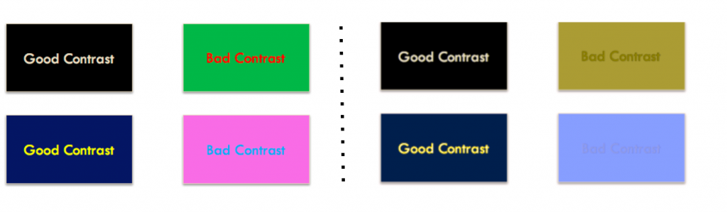
Successful sites often have terrific color contrast. Facebook, for example, was designed with an beautiful, accessible color scheme because Mark Zuckerberg himself is colorblind! Good color choice is not just about improving the experience of users with accessible needs, but improving the experience for everyone.
Even under normal conditions, the above “bad contrast” examples hurt to look at. In color-blind or vision-impaired conditions, they become downright unreadable. To see how a site looks in various color-blind conditions, check out this awesome tool, which displays side-by-side comparisons of how pages appear with and without filters for colorblindness. Does your site pass the contrast test?
Ensuring proper contrast is about more than picking the right color scheme, however. Thin, ultra-light, trendy fonts create problems at certain sizes. Users with anything less than perfect vision will have a hard time reading them.

I have to squint to read the red-highlighted text, and I have 20/20 vision. Squinting, in fact, is a good informal test for a site’s font accessibility. If you can’t read it while squinting, users with less-than-perfect vision won’t be able to read it at all.
Keep this in mind when designing for accessibility: you’re designing for yourself in the future. Would your older, bespectacled self have a hard time viewing the above text?
Use the Right HTML Tags
Bad:
<div class="ui button">

Follow

</div>
Good:
<button class="ui button">

Follow

</button>
Don’t be creative with the use of HTML. For example:
• Don’t use a fancy <a> link as a button.
• Don’t use a fancy <div> as a button.
• Use a <button> for buttons.
• Use an <a> tag for links.
• Use a <div> tag for organizational divisions.
Screen readers utilize the HTML of the page to decide what they read aloud to the user. If the a developer gets “creative” with the use of HTML, the context of an action will become more confusing. A link, for example, implies a jump to someplace else—if it’s used instead for a site-specific action, like checking out a shopping cart full of items, this could make the successful operation of the site more difficult to parse for a user with accessibility needs.
Why is this? Besides the muddled context, consider for a moment that navigating a site with a screen reader will require reading aloud every element on a site. To quicken this process, screen readers have the ability to filter and group HTML tags on a site for convenience. If a user looking to purchase an item knows they don’t care about exploring the site, they’ll likely filter out all <a> links from the screen reader and only read aloud relevant <button> tags. If the critical functionality of a shopping flow uses these <a> links, they’re going to have a tough time figuring out what the heck is going on.
For many, correlating HTML tags to the proper context may seem obvious. However, this problem is extraordinarily common—Semantic UI, one of the top three frontend UX libraries, was a major offender until relatively recently. Semantic formerly operated by using <div> tags and jQuery for almost every feature. At a previous startup where I used Semantic extensively, the accessibility issues with this pattern were discovered the hard way during a compliance review.
Use Labels
<label for="tac">

<input id="tac" name="terms-and-conditions" type="checkbox" />

I agree to the Terms and Conditions

</label>

<p>

<a href="terms-and-conditions.html">Read our Terms and Conditions</a>

</p>
Screen readers are designed to seek out and prioritize certain HTML tags that are useful for navigation. <label> tags are one of the most important of these sought-out tags; if they’re included in a form, it makes the navigation experience significantly better. Thus, it’s good practice to include a <label> with every navigable form element. If labels are included, the reader will smoothly move between and announce every form element without having to dig into potentially unreliable and/or messy <input> labels or placeholder attributes.
There are some caveats: avoid putting links, headers, or anchors inside the label tag (See above example). Doing so will disrupt the screen reader’s built-in navigation and make form interaction more difficult. Why? Because links, headers, and anchors also belong to this elite class of prioritized, sought-out navigation tags. Thus, nesting a priority navigation tag inside another priority tag will force the screen reader to make a possible confusing decision.
What about not using labels for design reasons? I get it, there are some gorgeous, super-cool form inputs out there with far superior UX than the dusty old label.
No problem. Just use the <aria-label> tag!
<aria-label> operates as an invisible label. This label will only be read by screen readers. They’re part of a class of special tags known as aria landmarks which can be used for better site navigation with accessibility tools. A full description of aria landmarks is beyond the scope of this blog post, but I definitely recommend checking out this linked page for a richer description.
Accessibility isn’t just about improving the experience for users with accessibility needs. It’s about improving the experience for everyone. Creating a great, accessible site means being a great, disciplined developer. How clean is your HTML? How effective is your design scheme? Knowing the full Web Content Accessibility Guidelines by heart is a daunting task that isn’t expected of developers, but it’s good to start somewhere. Start with the low-hanging fruit; for people who rely on website accessibility, the impact will be immediate and impactful.
For any questions, comments, or feedback, feel free to reach out: wbratches[at]inrhythm[dot]com.

Leave a Reply