
Overview
A Senior Product Manager specializing in Enterprise Design Language Systems offers expertise in creating, scaling, and optimizing cohesive Design Language Systems that drive efficiency, consistency, and innovation across large organizations. By leveraging their deep understanding of product development, user experience, and cross-functional collaboration, they empower enterprises to accelerate innovation, hack their own bureaucracies, and enhance product quality while reducing design debt, as well as development and maintenance costs.
In Ashton Coghlan’s Lightning Talk session, we will be uncovering the the primary strategies for effectively Product Managing Design Language Systems:
- Overview
- What Is A Design Language System?
- What Does A Product Manager Bring To Your Design Language System?
- Top 10 Reasons To Hire A Product Manager
- Closing Thoughts
What Is A Design Language System?
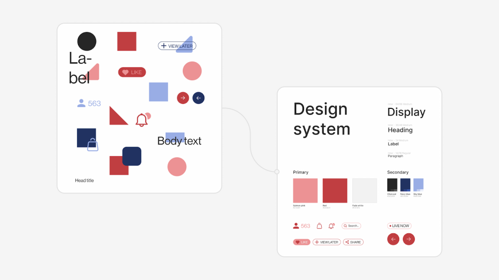
By direct definition, a Design System is a collection of reusable components, guided by clear standards, that can be assembled together to build any number of applications. According to Emmet Connolly, Director Of Product Design at Intercom, “… most Design Systems are really just Pattern Libraries: a big box of UI Lego pieces that can be assembled in near-infinite ways. All the pieces may be consistent, but that doesn’t mean the assembled results will be. Your product is more than just a pile of reusable UI elements. It has structure and meaning. It’s not a generic web page, it’s the embodiment of a system of concepts.”
The Design Language System can be considered the source of truth for how elements look and behave.
- Designers, developers and content authors can use the DLS to check if an element of design already exists
- Content authors can use the DLS for instructions on how to use certain design components
Like a natural language, the Design Language System is supposed to grow over time as components are progressively added to it.
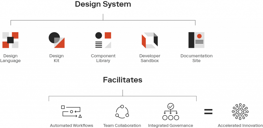
Design Language Systems are aimed to be a shared Language for understanding design, that transparently leads to understanding implementation.
In short, a Design Language System is a living, breathing organism that guides and supports the building blocks of your product.
What Does A Product Manager Bring To Your Design Language System?
Design Systems have become an essential part of efficient product development workflows, and there is a great benefit to treating the system as a product itself. Design Systems are ever-evolving tools and processes that need product management to support the full lifecycle from the initial build throughout ongoing maintenance and iterations.
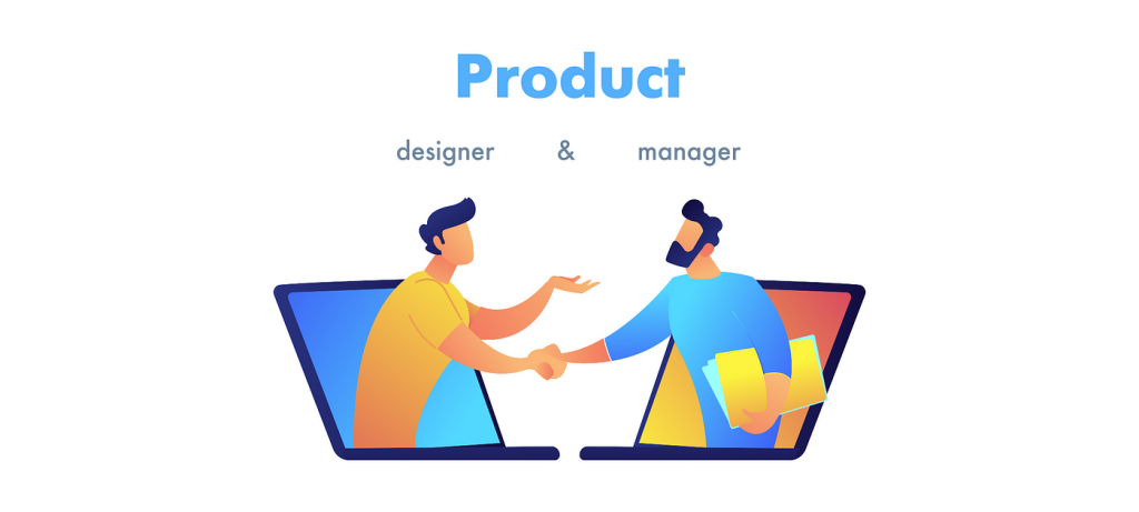
The collaborative efforts of a cross-functional product trio including design, engineering, and product management are key to building a successful Design System that will continue delivering value to an organization over time.
As the Design System matures, a product manager can help keep a groomed backlog for new releases, maintain intake and support processes, and measure/report on the impact of the Design System to ensure ongoing investment.
Top 10 Reasons To Hire A Product Manager
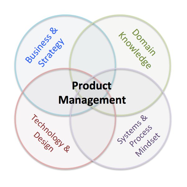
Where system designers and engineers have the subject matter expertise to build a Design System that’s compatible with current workflows and technology, a dedicated product manager can help align the vision for the System to the goals of the organization, prioritize the roadmap based on those goals, and build a communications strategy to drive adoption and create feedback loops with consuming teams.
Proven benefits of hiring a Product Manager to support the implementation of your Design Language System are:
- Cross-functional Collaboration– A product manager facilitates communication and collaboration among different teams, such as design, development, and business. This ensures that the Design Language System meets the needs of all stakeholders.
- Strategic Vision– Product managers have the ability to define and execute a long-term strategy for the Design Language System, ensuring it aligns with the company’s goals and objectives.
- Prioritization– With many competing demands, a product manager can prioritize features and improvements to the Design Language System, maximizing the value delivered to the organization.
- Customer Focus– Product managers have experience understanding customer needs and incorporating their feedback into the Design Language System. This ensures a user-centric approach that improves usability and adoption (Your downstream product teams are your customers).
- Change Management– Implementing a Design Language System can involve significant changes in processes and tools. A product manager can help manage these changes, ensuring a smooth transition and minimizing disruptions.
- Metrics And Measurement– Product managers track and analyze metrics related to the Design Language System’s adoption, usage, and effectiveness. This data-driven approach helps identify areas for improvement and demonstrates the value of the Design Language System to stakeholders.
- Scalability– As your organization grows, a product manager can ensure that the Design Language System scales effectively, addressing the needs of an increasing number of users and projects.
- Documentation And Training– Product managers can oversee the creation of clear, concise documentation and training materials, ensuring that team members can easily access and understand the Design Language System.
- Continuous Improvement– Product managers are adept at iterating on products and systems, ensuring that the Design Language System remains up-to-date and evolves with the needs of the organization and industry.
- Budget And Resource Management– A product manager can help allocate resources efficiently, making the most of your budget and ensuring that the Design Language System’s development stays on track.
These factors not only enhance the viability of the Design Language System from the start – but provide a solid foundation for its enduring influence within your organization.
Closing Thoughts
Working with the client, Product Managers craft a tailored Design Language System strategy that aligns with their unique business objectives, elevates their brand, and fosters a seamless user experience across all their digital products and platforms.


