Based on a Lightning Talk by: Suman Kumar, Senior Software Engineer @ InRhythm on January 25th, 2024

Overview

WebAssembly (Wasm) and Rust have emerged as a powerful duo, transforming the landscape of software engineering. Wasm is a binary instruction format that allows high-performance execution on web browsers, enabling near-native speed for web applications. Rust, with its focus on performance and memory safety, seamlessly integrates with Wasm to create a potent combination.
In this article, we will delve into WebAssembly and Rust, unraveling its primary principles, how it works, and the many ways it can enhance your software engineering workflows:
- Overview
- Understanding WebAssembly
- How WebAssembly Works
- Implementing WebAssembly With Rust
- Why WebAssembly Matters
- Practical Application Examples
- Implementation In Software Engineering Workflows
- Closing Thoughts
Understanding WebAssembly

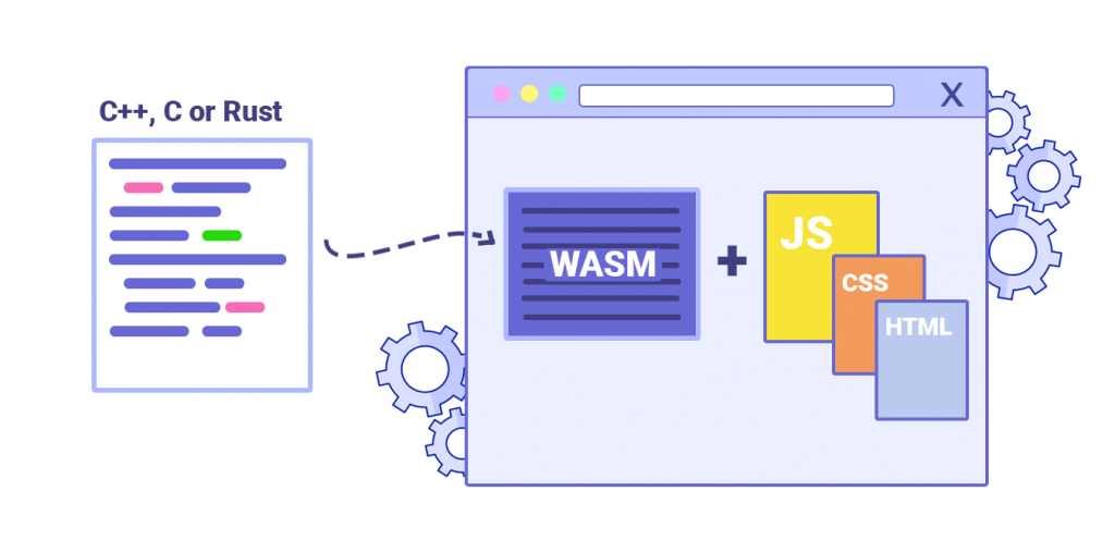
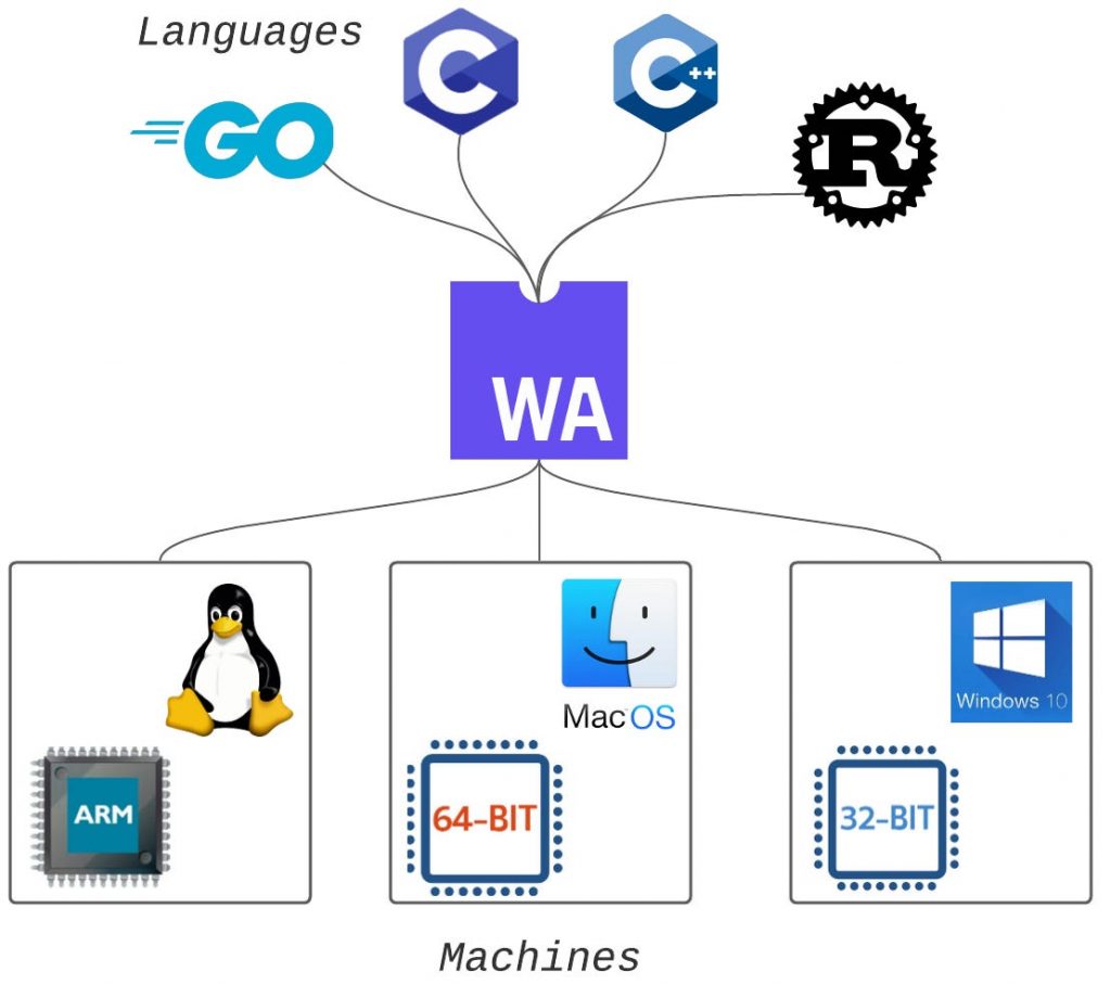
WebAssembly is a low-level virtual machine that runs code written in languages like C, C++, and Rust. It provides a portable compilation target for deploying applications on the web. Instead of relying on JavaScript for performance-intensive tasks, Wasm allows developers to use languages traditionally reserved for system programming.
How WebAssembly Works
Wasm operates as a stack-based virtual machine with a compact binary format. This format is designed to be both fast to decode and small to transmit over the network. It runs alongside JavaScript in the browser, allowing developers to leverage the strengths of both languages.
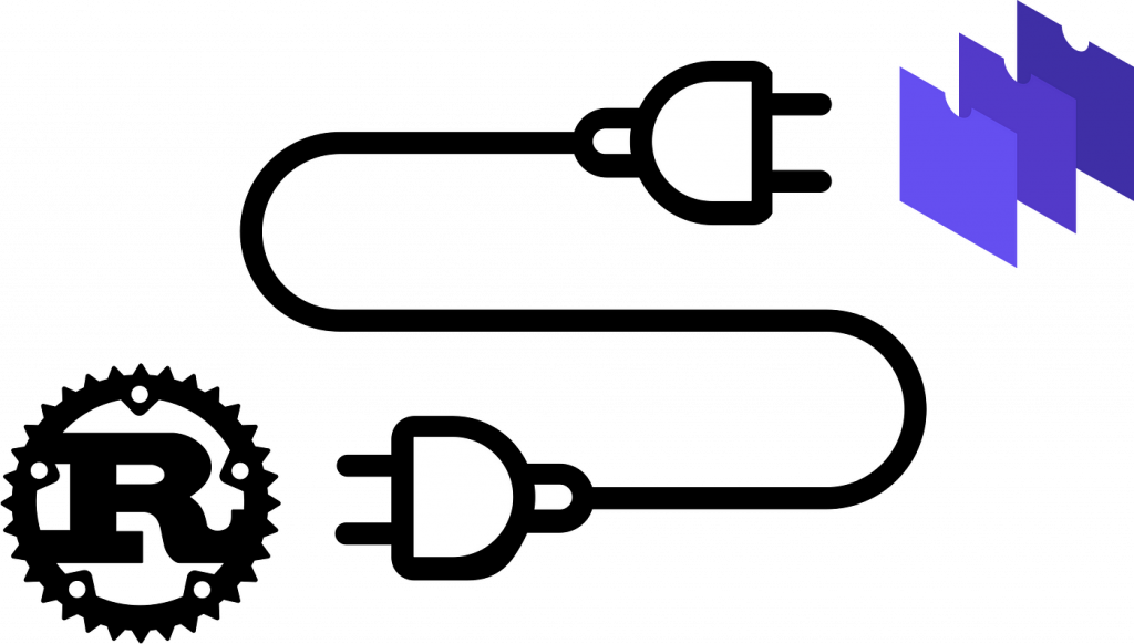
Implementing WebAssembly With Rust
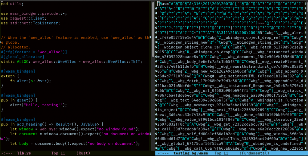
Rust’s memory safety features make it an ideal language for writing Wasm modules. The Rust compiler can target WebAssembly directly, translating Rust code into Wasm binaries. This integration ensures that the resulting modules are not only performant but also secure.
Why WebAssembly Matters
- Performance
Wasm enables high-performance execution, bringing near-native speeds to web applications.
- Language Agnosticism
Developers can write code in languages other than JavaScript, broadening the range of tools available.
- Portability
Wasm modules can run in any environment that supports the standard, not limited to web browsers.
Practical Application Examples
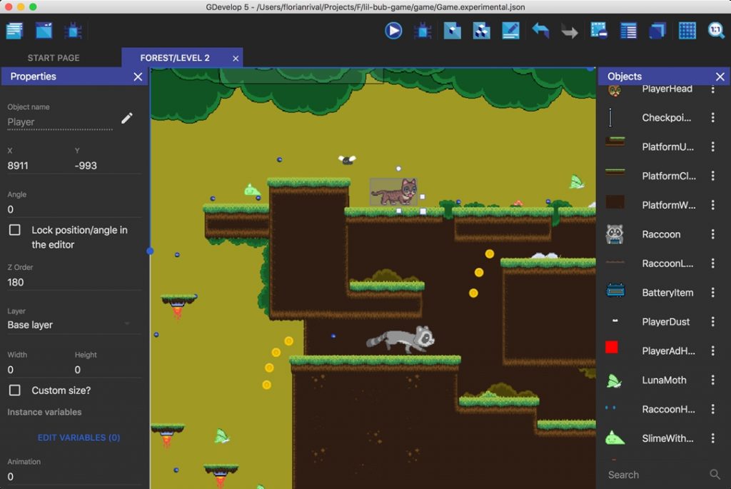
- Game Development
Wasm is well-suited for graphics-intensive tasks, making it an excellent choice for browser-based games.
- Multimedia Processing
Video and audio editing applications benefit from Wasm’s performance, providing a seamless user experience.
- Data Processing
Wasm is employed for tasks like image recognition and machine learning, where speed is crucial.
Implementation In Software Engineering Workflows

- Integrating Existing Code
Wasm allows incorporating legacy code into modern web applications without a complete rewrite.
- Microservices Architecture
Wasm modules can be deployed independently, fostering a microservices approach.
- Edge Computing
Wasm facilitates pushing computation to the edge, reducing latency for critical operations.
Closing Thoughts
WebAssembly, coupled with Rust, represents a paradigm shift in web development. Its ability to bring high-performance computing to the browser, coupled with Rust’s safety features, opens new possibilities for developers. As the ecosystem evolves, WebAssembly is set to play a pivotal role in the future of software engineering, offering unprecedented speed, portability, and flexibility.


